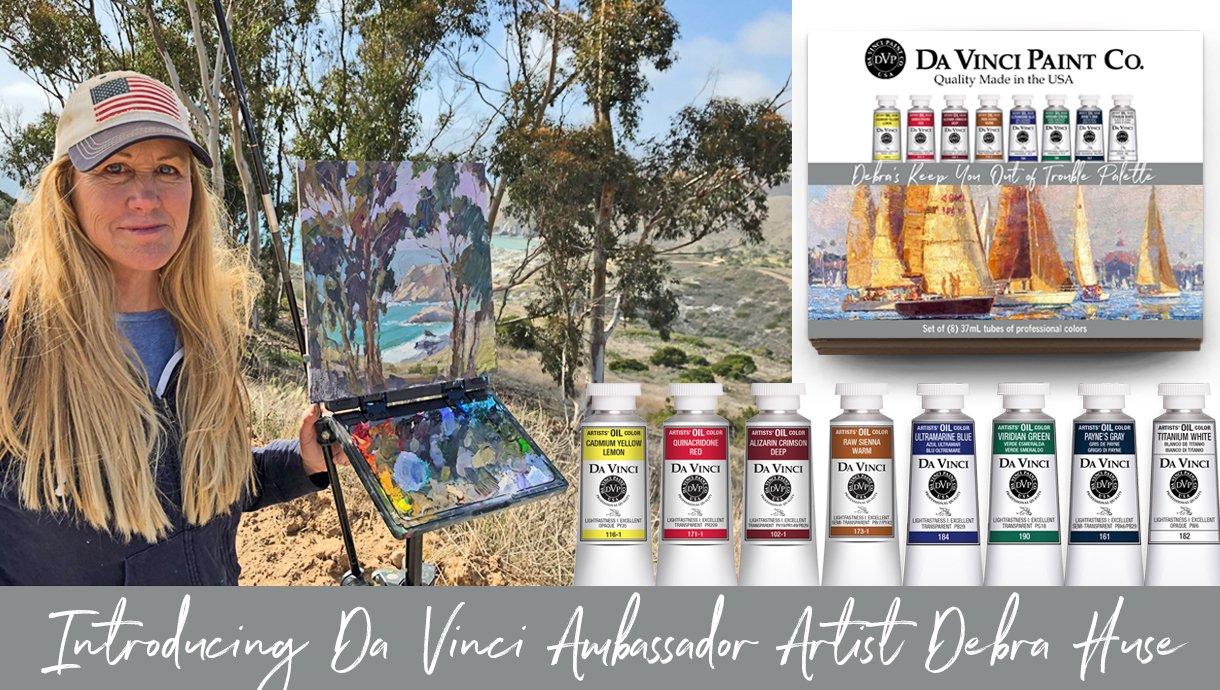
Da Vinci Paints Ambassador Debra Huse

We’re excited to introduce Da Vinci Ambassador Artist Debra Huse and announce the launch of Debra’s custom-curated Da Vinci oil palette, Debra’s Keep You Out of Trouble Palette. In addition to her palette launch, Debra’s 8-color oil palette contains three new Da Vinci oil colors: Cadmium Yellow Lemon, Raw Sienna Warm, and Alizarin Deep.
Debra is an award-winning artist and plein air painter who is known for painting on and off-shore scenes — literally! A longtime resident of southern California, Debra is often found working behind an easel on the deck of her boat while floating alongside the panoramic Pacific coastline.
Debra began painting when she was very young, and her mother encouraged Debra’s skills when she was 10 years old by signing her up for lessons with a professional artist. By the time Debra was in 6th grade, she was accomplished enough to win a scholarship to college summer art courses at John Heron Art Academy in Indianapolis. Her skills have only continued to flourish and grow, so join us as she shares some of her secrets to success.

Colorful Competition oil painting by Debra Huse
Hello, Debra, and thanks for sharing with us today! To get started, what is your favorite subject to paint, and please explain why.
I love to paint old harbors because they contain so much history along with interesting buildings, boats, and water. Any outdoor location is always a wonderful experience.
Why do you use Da Vinci Paints, and what do you most like about the company and/or paints?
Da Vinci oil paints are especially juicy; the high quality of the oil makes the paints very viscous. I love that the company is family owned and has a rich history and pride in craftsmanship, and I also like that the paint tubes have larger tops which are more convenient.
Over time you’ve refined a specific Da Vinci color collection that, as you like to say, keeps you out of trouble. Briefly explain how your palette helps keep artists out of trouble.
There are no troublemakers in this palette, or colors that are too bold or don’t play well with others. Through the years, I have narrowed down the colors that work well with each other and still yield many rich and beautiful results.

California Grandeur oil painting by Debra Huse
Your choice of palette colors and light-drenched, impressionistic artwork make it easy to visualize the airy warmth and active lifestyle of the California outdoors. How can artists who live in other areas also make the most of your Da Vinci palette colors?
The 8 colors in my palette are completely versatile and can be used to portray any region, because not only does this palette contain or will easily mix every color in the color wheel, but these colors also work really well with each other.
You’re obviously a master at depicting much movement and light with minimal brushstrokes. We’d love to think that Da Vinci’s oil paint consistency helps with this, but how can artists achieve the graceful brushwork that’s evident in your paintings?
Confident brushwork is an important element for a rich painting. Da Vinci’s oil paint has just the right consistency, and this is half of a successful painting. Learning how to keep your colors clean and having a planned, strategic approach when painting is the other half of success. This way, you can work fast in some areas and more slowly and intently in other areas.

You mentioned in one of your tutorials that you use Raw Sienna Warm as a dark yellow and that, when painting something that’s considered yellow, you’ll often mix Raw Sienna Warm with white to achieve a warm yellow. In closing, please share a few more creative tips on how to use your palette colors.
Yes! Yellow can be trouble in a painting as it may not look like a natural color. That’s why I start all of my yellows with a Raw Sienna Warm mixed with Titanium White and then tint it with yellows and oranges. Raw Sienna Warm can also be used as a brown to represent sand, a meadow, or a building color.
Cadmium Yellow Lemon mixed with Quinacridone Red results in beautifully warm yellow oranges, oranges, and red oranges. I’ll use the red-orange mix to depict a “glow zone,” or when the sun is near a tree or landmass. For example, a distant land mass may be purplish except near the sun where the glow effect takes place.
A beautiful, muted purple can be achieved by mixing Alizarin Deep with Ultramarine Blue and then adding a touch of Raw Sienna Warm. For a rich, intense violet, mix Quinacridone Red with Viridian Green.
Viridian Green is an interesting color. When mixed with a lot of white it actually looks aqua, then I’ll add a tiny bit of Cadmium Yellow Lemon to get a shimmer! Viridian Green mixed with Ultramarine Blue is great for depicting water. Add a touch of Payne’s Gray to quiet it down, if necessary.
Transparent darks are key for creating translucent shadows and shades. Use Alizarin Deep, Ultramarine Blue, Viridian Green, and Payne’s Gray, one at a time or together, to scrub in dark areas. They can run into each other and still produce great dark values without appearing too heavy. Apply by pushing the paint into the canvas with a short flat brush in a scrubbing manner to keep them rich but not too thick.
Try Cadmium Yellow Lemon with Payne’s Gray for realistic greens. The Payne’s Gray is transparent so it mixes well with the other darks and also yields beautiful grays!
I share many more insights on color solutions in my in-person and online workshops.

Da Vinci Ambassador Debra Huse
Explore Da Vinci’s newest oil colors and Debra’s Keep You Out of Trouble palette at our website. Learn more about Debra, her art, and upcoming workshops at debrahuse.com.
SUBSCRIBE TO DA VINCI PAINTS
Receive notification of new posts & promotional offers.
Da Vinci Paints never shares subscriber information.
We'd love to see what you create with Da Vinci Paints! Be sure to follow & tag us on social media.
@DaVinciPaints #DaVinciMoment