Artist Guide to the Color Wheel
A color wheel is a fantastic tool for an artist, and one doesn't need an advanced understanding of color theory to use it. If your paintings often look muddy or lack contrast or you struggle with mixing colors, begin by building a palette step-by-step using Da Vinci Paints’ colors from the color wheel.
In this post, we'll focus on foundational Da Vinci Paints' primary colors, share how to mix and choose secondary colors, and also share how to enhance your color palette by the addition of tertiary colors. If these terms are confusing to you, you’re in the right place. If you're already a color savant, we hope this informative article continues to ignite the spark of color creativity in your life!
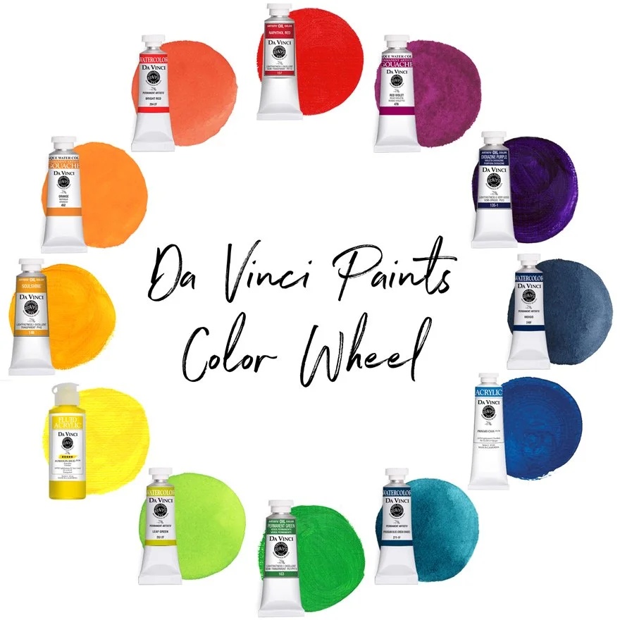
In the color wheel depicted above: Da Vinci primary color examples are Naphthol Red (oil), Primary Cyan (heavy-body acrylic), & Aureolin Hue (fluid acrylic). Da Vinci secondary color examples are Orange (gouache), Dioxazine Purple (oil), & Permanent Green (oil). Da Vinci tertiary color examples are Red Violet (gouache), Indigo (blue-violet watercolor), Prussian Blue Green Shade (blue-green watercolor), Leaf Green (yellow-green watercolor), Soulshine (yellow-orange oil), & Bright Red (red-orange watercolor).
What is the color wheel?
The color wheel is simply a visual tool that displays how colors interact with each other. It was originally charted by Isaac Newton who took the visual color spectrum and placed it into a circular format to better showcase color relationships. Colors on the color wheel are grouped into three main categories: primary, secondary, and tertiary colors.
Since the color spectrum is only limited by the colors that a human eye can perceive, a color wheel can be as in-depth as time and space allow. Although it can be helpful for artists to understand other paint, pigment, and color terminology such as complementary, hue, value, saturation, tint, etc, for most artistic purposes, the three main categories are all that one needs to create a professional color palette and master basic color mixing skills.
Choosing Da Vinci Primary Colors
There are three primary colors: red, yellow, and blue, sometimes referred to as magenta, yellow, and cyan. These three colors form the foundation or basis for the color wheel and are used to create or mix all other colors. Although it's possible to mix a color that can work as a primary, true primaries are colors that are nearly impossible to mix and are carefully chosen by artists as essential colors in a palette.
In painting and in palettes, primary choices vary and depend solely upon artist preference. For example, some artists prefer a cool, semi-violet red as a primary while others lean towards warm red-oranges. Many artists keep both cool and warm primaries in their palettes, often referred to as a split-primary palette (for example, the Da Vinci Paints’ Artist Watercolor Mixing Palette) because each color will impart a different result in mixes. This is one of the many things that makes mixing colors so interesting and fun!
Although Da Vinci Paints' offers artists an exciting array of warm, cool, and neutral primaries in professional watercolors, oils, heavy-body acrylics, gouache, and fluid acrylics, when building a solid foundation for a basic palette, it may be helpful to begin with only three essential primaries in more neutral colors like the ones featured above.
To learn more about Da Vinci primary colors, click on the article links below, or visit our website to explore Da Vinci primary colors in all paint mediums.
Choosing or Mixing Da Vinci Secondary Colors
Secondary colors are created from two-color, primary mixes and include orange, green, and violet or purple. As you can see in the example below, primary red and yellow will mix orange, primary blue and yellow will create green, and primary red and blue combine to create violet.
To mix true secondary colors, artists can begin by blending equal amounts (1:1 ratio) of each primary color* because different ratios of each color (e.g. one parts blue to two parts red or a 1:2 ratio) will typically create tertiary colors. Tertiary colors are those that fall between primary and secondary colors on the color wheel, and we'll address those colors in a moment.
In masstone, many oil and acrylic colors appear much darker than they are in application like when glazing or painting, so when mixing colors with these paints, the addition of white is often used to tint the mix and allow the true color to come forward.
To eliminate time spent mixing and to maintain color consistency within a painting and palette colors, artists often add Da Vinci Paints' secondary tube colors to the primary colors in their palette. Many non-primary paint colors are referred to as convenience blends or colors because these single or multi-pigment hues are more convenient than mixing every non-primary palette color.
Da Vinci Paints' offers artists an excellent selection of single and multi-pigment secondary colors in professional watercolors, oils, heavy-body acrylics, gouache, and fluid acrylics. To learn more about choosing and mixing secondary colors, click on the article links below, or visit our website to discover all of our professional secondary color options for artists.
*When mixing secondary colors, a 1:1 ratio is a great place to start, but some paint colors have higher tinting strength than others which means that their pigment's molecular structure makes 'a little go a long way,' so to speak. Time and experience will easily train you to create balanced mixes, but Da Vinci Paints' carefully crafted secondary colors are certainly a convenience to artists of all skill levels!
Choosing or Mixing Da Vinci Tertiary Colors
Tertiary colors are those that fall between primary and secondary colors on the color wheel and are traditionally created by blending a primary color with a secondary color. For example, red mixed with orange produces a red-orange color while yellow mixed with orange produces a yellow-orange. Following this format, there are six tertiary colors: Yellow Orange and Red Orange, Yellow Green and Blue Green, Red Violet and Blue Violet.
However, when it comes to color, artists are often anything but traditional! There are many ways to create tertiary colors by mixing two, three, or even more colors, and many popular and even essential artist palette colors aren't easily defined by a standard color wheel. However, beginning artists will usually mix the cleanest, most vibrant colors by following the time-tested recipes straight from the color wheel.
If you’d prefer to keep things simple, there are two, easy ways to mix a tertiary color using only two colors. First, instead of adding even ratios of two primary colors like one would when mixing a secondary color, simply adjust the amounts of each primary color to about a 2:1 ratio. For example, a 2:1 ratio of blue to red will usually result in a blue-violet color. As mentioned above, another easy way to mix a tertiary color is to simply mix a secondary color to a primary color.
You can see examples of either of these options in the illustration above. The secondary color (violet) is located in the middle of the mixing range, and the tertiary colors (blue violet and red violet) are shown between the primary and secondary colors. A small amount of white was added to the acrylic mixes to tint the mixes and bring the colors forward, but this isn't always necessary.
When mixing, a paint’s unique properties (opacity, granulation, tinting strength, etc) can influence a mix, so mixing recipes and ratios aren’t a set rule. Also, as previously mentioned, the addition of white may be necessary to tint certain mixes to achieve a suitable outcome. However, creating an artist palette using high quality paints that’s built upon the basics of the color wheel will give artists a solid foundation to easily and enjoyably experiment, quickly learn, and immediately grow!
A quick option to mixing tertiary colors is to choose from our professional quality, pre-made Da Vinci Paints’ tertiary colors. Just like with secondary and primary colors, Da Vinci Paints offers artists a wide selection of tertiary colors in all paint mediums. Adding pre-made tertiary colors along with earth colors and more to a palette can save valuable time usually spent in mixing and help create consistency and harmony in a palette and paintings.
Color theory, or the study of color relationships, is a fun pastime for many and a valid science, and it can be helpful for artists to understand the color wheel and the basics of color theory more in-depth than covered here. However, keep in mind that much of color theory and palette preference is relative to each individual artist. There really isn’t such a thing as a ‘wrong’ color, so when creating an artist palette and exploring color mixes, we highly encourage you to have fun and go with what you love!
Discover more about Da Vinci colors and mixes in the articles below, or view our complete color collection at our website.
SUBSCRIBE TO DA VINCI PAINTS
Receive notifications of new posts & promotional offers.
Da Vinci Paints never shares subscriber information.
We'd love to see what you create with Da Vinci Paints! Be sure to follow & tag us on social media.
@DaVinciPaints #DaVinciMoment

